
.png)
The difference between a successful e-commerce business and one that struggles often comes down to conversion optimization. While many merchants focus on driving traffic, converting that traffic into paying customers is the real challenge. That’s where a landing page funnel comes in.
A well-designed landing page funnel can increase your conversion rates by 10% - 30% compared to standard product pages. It’s the difference between a 2% conversion rate and a 6% conversion rate, directly translating to tripling your revenue from the same amount of traffic.
As someone who has optimized thousands of landing page funnels across various e-commerce verticals, I’ve seen firsthand how proper funnel design can transform struggling businesses into profit machines. The strategies I’ll share have generated millions in additional revenue for e-commerce brands by systematically removing friction and guiding visitors toward purchase decisions.
What Is a Landing Page Funnel?
A landing page funnel is a structured sequence of web pages designed to guide visitors through a specific journey, from initial interest to final conversion. Unlike a standard landing page that serves as an entry point, a funnel consists of multiple interconnected pages that progressively move prospects closer to making a purchase decision.
The fundamental distinction lies in the approach. A standard landing page typically tries to accomplish everything on one page, i.e., educate, persuade, and convert. A landing page funnel, however, breaks this process into digestible stages, allowing you to address different psychological states and objections at each step.
In the sales funnel context, landing page funnels serve as the conversion mechanism that transforms cold traffic into warm leads and eventually paying customers. They work by building trust, demonstrating value, and reducing perceived risk while increasing desire for your product or service.
Landing page funnels play a crucial role in converting traffic. While your marketing campaigns bring visitors to your site, the landing page funnel determines how many of those visitors actually convert. Think of it as the bridge between marketing spend and revenue generation.
Elements of a Funnel Landing Page
Every high-converting funnel landing page contains specific elements that work together to drive conversions. Understanding these components is essential for building effective funnels.
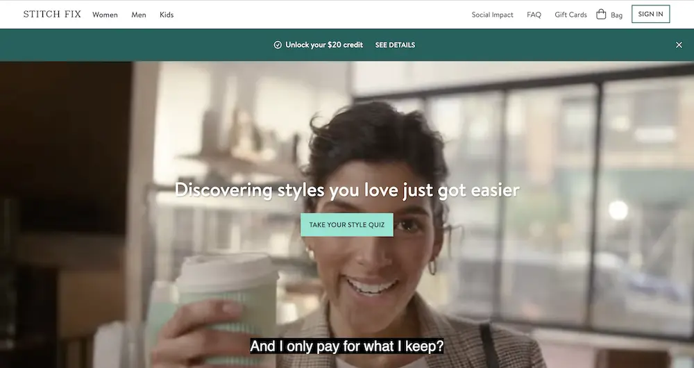
Compelling Headline:
The compelling headline and subheadline serve as your first impression. Your headline must immediately communicate the primary benefit or solution you’re offering. It should be specific enough to attract your target audience while filtering out unqualified visitors. The subheadline supports the headline by providing additional context or addressing potential objections.
See this excellent example from Stitch Fix:
Benefit-driven copy:
Your offer is the centerpiece of your funnel. This could be a physical product, a digital service, a free trial, or a lead magnet like a comprehensive guide. The offer must provide clear value that matches the visitor’s intent and stage in the buying process. The perceived value of your offer directly impacts conversion rates.
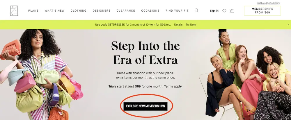
Call-to-action:
The call-to-action (CTA) button is where conversion happens. Its placement, color, text, and design significantly impact performance. The most effective CTAs use action-oriented language that creates urgency while clearly stating what happens next, like this:
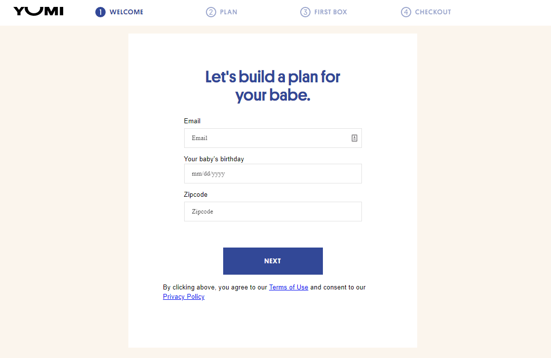
Lead capture forms:
Lead capture forms collect visitor information, transforming anonymous traffic into identifiable leads. The number of form fields, their labels, and positioning affect completion rates. Generally, shorter forms convert better, but longer forms often generate higher-quality leads. Here’s an excellent example from Yomi:
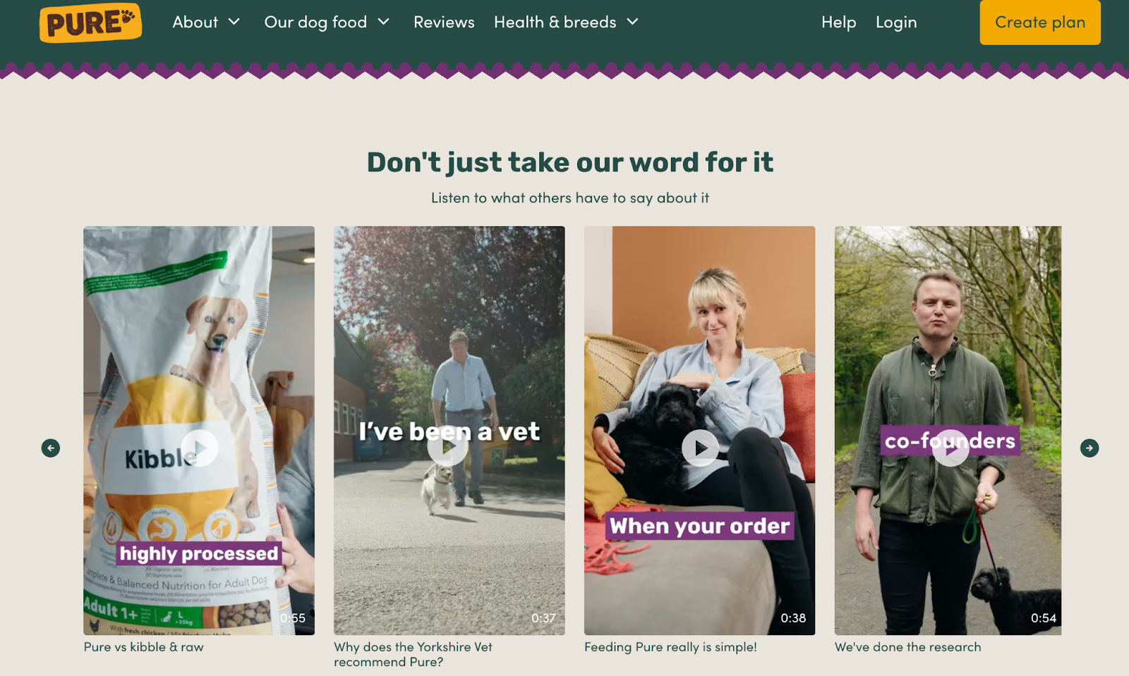
Social proofs:
Social proof and trust elements reduce friction by addressing common concerns about credibility, security, and value. This includes customer testimonials, security badges, money-back guarantees, and social media follower counts. These elements become more critical as the value of your offer increases. I love how pure Vet Food, a pet-approved dog food company, placed video reviews on their homepage to increase trustworthiness:
Stages of a Landing Page Funnel
These are the stages of a landing page funnel:
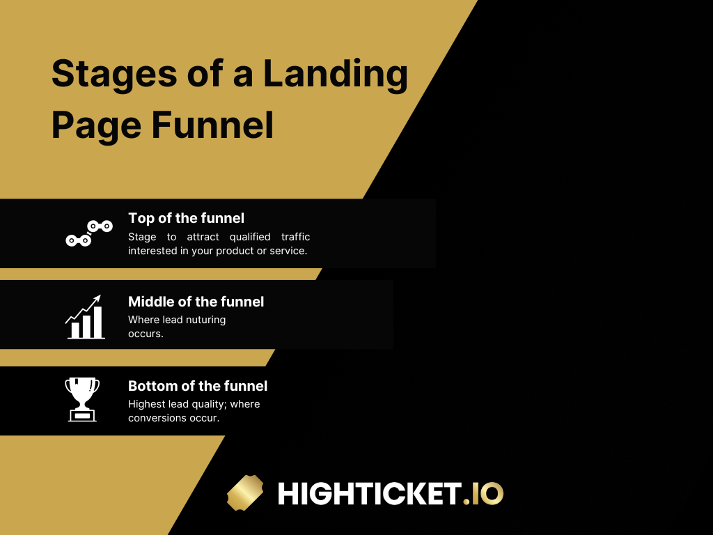
Top of the Funnel (ToFu)
The top of the funnel focuses on attracting qualified traffic, i.e., visitors who genuinely need your product or service. This stage is about awareness and initial interest generation.
Qualified traffic differs from general traffic because these visitors have demonstrated some level of intent. They might have searched for specific keywords, clicked on targeted ads, or arrived through relevant content. The quality of your top-of-funnel traffic directly impacts your overall conversion rates.
Middle of the Funnel (MoFu)
The middle of the funnel is where lead nurturing occurs. Visitors at this stage are aware of their problem and are considering potential solutions. At this point, your job is to educate them while subtly positioning your recommended product or service as the ideal choice.
Nurturing leads means delivering value without immediately asking for anything in return, which helps build trust, establish your authority, and keep prospects engaged throughout their decision-making process.
Nurturing leads involves providing value without asking for anything in return. This builds trust and establishes your expertise. Email sequences, educational content, and free resources are common nurturing tactics.
Effective nurturing often includes a mix of email sequences, educational blog posts, and free resources, all designed to answer questions, remove doubts, and deepen the prospect’s understanding of their options.
Education plays a key role here because well-informed buyers make decisions more confidently and tend to convert faster and experience less regret after purchasing.
Bottom of the Funnel (BoFu)
The bottom of the funnel is where conversions take place. Visitors at this stage are on the verge of deciding and simply need the right nudge to move forward. They’ve already done their research, understand the product’s core value, and are now evaluating the final details before committing.
Your role here isn’t to re-explain the basics, but to address lingering objections, remove friction, and make the path to purchase as seamless as possible.
This is the time to fine-tune your sales pitch by focusing on specific concerns, such as pricing, guarantees, support, or implementation. A well-crafted message that directly speaks to these final hesitations can also provide the reassurance needed to close the sale.
For an in-depth guide on boosting your funnel’s ROI, check out Landing Page Funnel: How to Maximize Your Conversion Rate.
How to Build a High-Converting Landing Page Funnel
Building a high-converting landing page funnel requires systematic planning and execution. Each step builds upon the previous one, creating a cohesive experience that guides visitors toward conversion.
Step 1 – Define Funnel Goals
Before creating any pages, you must clearly define what action visitors want to take. This seems obvious, but many funnels fail because they try to accomplish multiple goals simultaneously, which dilutes effectiveness.
Your primary goal might be generating immediate sales, capturing leads for future nurturing, booking consultation calls, or building an email list. Secondary goals can include social media followers or content downloads, but these should never interfere with your primary objective.
The specificity of your goal affects every aspect of your funnel design. A lead generation funnel optimizes for form completions, while a direct sales funnel focuses on purchase conversions. Mixing these approaches often results in suboptimal performance for both objectives.
Step 2 – Choose a Landing Page Builder
Your technology choice impacts both the development process and ongoing optimization capabilities. Different platforms excel in other areas, so your selection should align with your technical expertise and business requirements.
Some practical tools are:
- ClickFunnels is purpose-built for creating sales funnels and includes features like A/B testing, email automation, and payment processing. It’s ideal for businesses focused primarily on funnel-based marketing, but can be expensive for simple landing pages.
- Leadpages offers strong template selection and ease of use, making it suitable for businesses that need landing pages quickly. Its integration capabilities with email marketing platforms and CRM systems make it popular among small to medium-sized companies.
- Unbounce provides advanced customization options and powerful A/B testing capabilities. It’s preferred by agencies and larger businesses that need granular control over design and optimization. The learning curve is steeper, but the flexibility is unmatched.
When choosing a landing page builder, consider factors like how much design freedom you need, which tools it integrates with, whether it can scale as your business grows, and most importantly, whether your team can use it effectively. The best tool isn’t necessarily the most powerful; it’s the one that fits seamlessly into your process and helps you deliver results consistently.
Step 3 – Design and Copywriting
Converting visitors into leads or customers requires a seamless blend of persuasive copy and intentional design, as both elements complement each other in a landing page. Great messaging can easily be lost in cluttered or confusing layouts, while visually stunning pages won’t convert if the copy lacks clarity, relevance, or emotional pull. The two must work hand in hand to guide the visitor toward action.
Here’s how:
Conversion-optimized copy should speak directly to your visitors’ pain points, goals, and motivations. It mirrors your prospects’ language, addresses their concerns, and positions your offer as the natural, no-brainer solution. The best copy doesn’t sound like a hard sell. It should be a helpful conversation with someone who understands precisely what the visitor is going through and how to help them solve it.
The same principle applies to design.
Every visual element on the page – layout, color, typography, spacing, and imagery – should work together to support the message and lead the visitor toward a single, clear action. Clean, uncluttered layouts help maintain focus, while consistent use of brand colors and fonts builds trust and recognition.
White space is just as important as visuals, giving the content room to breathe and guiding the visitor’s eye down the page in a logical flow.
Again, see an example from Pure Vet Pet food:
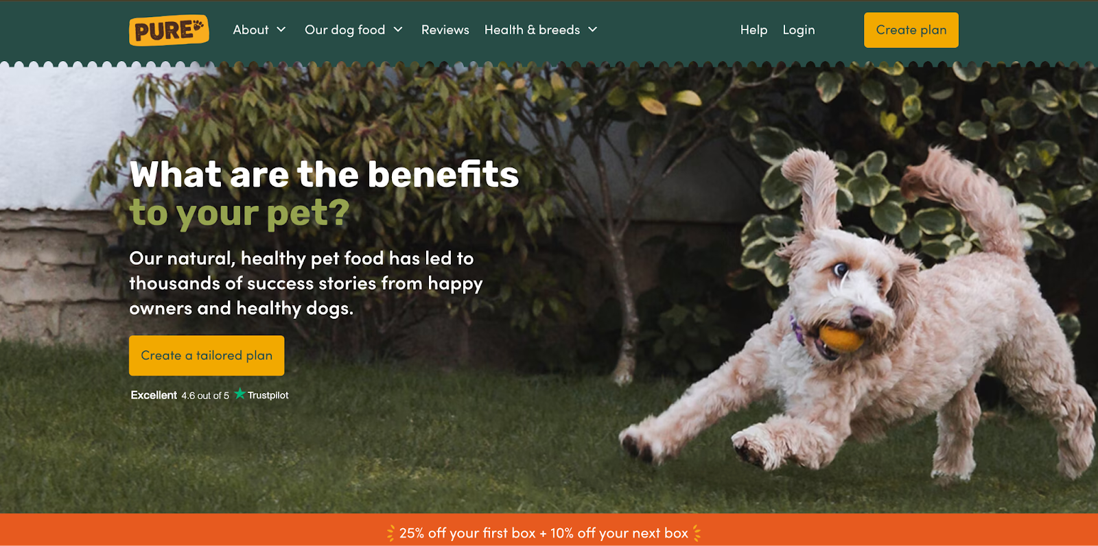
The copy immediately poses a question that taps into the visitor’s core concern: “What are the benefits to your pet?” followed by a reassuring statement emphasizing natural, healthy food backed by success stories. This helps build credibility and positions the product as a proven solution.
Testing different copy variations often reveals surprising insights about what resonates with your audience. Small changes in wording can produce significant improvements in conversion rates.
Step 4 – Link Funnel Stages Seamlessly
Every step of your funnel should feel like a natural progression from the last. Visitors shouldn’t feel like they’re jumping between unrelated pages. Instead, they should experience a smooth, intuitive flow that aligns with the expectations set from the very beginning. The messaging, visuals, and intent must remain consistent and cohesive from the moment they click your ad to the final thank-you page.
For example, if your ad promises a “free guide to increasing sales,” your landing page should make that guide the clear focal point, not bury it beneath unrelated offers or force visitors to hunt for it. The headline, imagery, and call-to-action should all reinforce the promise made in the ad, creating a sense of alignment and trust.
Maintaining this consistency also extends to your visual design. Fonts, colors, tone of voice, and imagery should match from page to page so users don’t feel like they’ve been redirected to a completely different experience. This visual coherence reinforces brand trust and keeps attention focused on the goal.
Even navigation plays a role here. In focused funnels, it’s often best to remove or limit distractions such as full menus or outbound links and guide visitors forward with simple, linear steps. While it may feel counterintuitive to restrict options, streamlined funnels tend to outperform general-purpose pages because they remove confusion and decision fatigue, making it easier for visitors to follow through.
When each stage of your funnel is tightly connected and optimized for clarity, visitors move through with confidence, and that confidence is what drives conversions.
Lead Magnets and Free Offers
Lead magnets serve as the entry point for many successful e-commerce funnels. They provide immediate value in exchange for contact information, allowing you to build relationships with prospects not ready to purchase immediately.
Here are some examples of lead magnets:
- Free trials work exceptionally well for software or service-based businesses. They allow prospects to experience value before committing to payment, reducing perceived risk while demonstrating capabilities.
- Free guides or resources work for businesses where education is part of buying. A comprehensive guide establishes expertise while providing genuine value, making prospects more receptive to future communications.
- Discount coupons are straightforward lead magnets that work well for e-commerce businesses. They provide immediate gratification while creating urgency to complete a purchase within the coupon’s validity period.
The key to effective lead magnets is to attract ideal customers rather than bargain hunters or freebie seekers. The type of lead magnet you offer influences the quality of leads you generate.
How to Optimize Your Funnel for Maximum Conversions
Optimization is an ongoing process that separates high-performing funnels from mediocre ones. Small improvements, often resulting in dramatic conversion rates and revenue increases, compound over time.
Use A/B testing
One of the most effective optimization techniques is A/B testing. You gain valuable, data-backed insights into what resonates best with your audience by testing elements such as headlines, CTA button copy, color, or placement.
For instance, a headline test might explore different ways of framing the same benefit (emotional vs. practical), while a CTA button test might compare “Get Started Now” against “Claim My Free Trial.”
The key is to test one variable at a time to isolate its impact and make confident, incremental improvements.
Make your pages mobile-friendly
Equally important is ensuring your funnel is mobile-friendly. With mobile traffic often surpassing desktop for e-commerce businesses, it’s no longer acceptable to treat mobile responsiveness as a secondary concern.
Your landing pages, checkout flow, and content should be optimized for small screens. This includes:
- Fast loading times
- Intuitive navigation,
- Easily tappable buttons,
- Legible text, and short,
- User-friendly forms.
A clunky mobile experience can quickly erode trust and lead to abandoned funnels, regardless of how compelling your offer is
Ensure visual hierarchy
Visual hierarchy is another crucial factor impacting user experience and conversion performance. Your page should guide visitors’ attention naturally, from headline to subheadline, down through body content, and ultimately to the CTA.
Use contrast, size, whitespace, and positioning to direct the eye, and ensure that the most critical elements, such as your value proposition and CTA, appear above the fold. Supporting content should be accessible as users scroll, but never compete with or overwhelm the core message.
Keep your page design clean.
The overall layout and spacing of your page also matter. Pages cluttered with too much information or many calls to action can confuse or overwhelm users.
On the other hand, a clean layout that uses ample white space and clear content sections encourages focus and makes your message easier to digest.
Remember: simplicity sells. A well-organized, visually intuitive funnel looks more professional and leads to higher conversions and a better user experience.
How to measure the performance of your landing page
Measuring performance requires tracking the right metrics and understanding what they indicate about visitor behavior. Focus on metrics that directly relate to your business objectives rather than vanity metrics that don’t impact revenue.
Some of the key metrics to track are:
Bounce rate
One of the most common metrics to monitor is bounce rate, which shows the percentage of visitors who leave your page without taking action.
A high bounce rate may point to issues such as irrelevant traffic sources, unclear messaging, or a poor user experience. That said, bounce rate doesn’t always tell the full story. Some users might be in the early research phase and return later to convert. So, it should be evaluated in combination with other behavioral signals.
Conversion rate:
The conversion rate is often the most critical metric, representing the percentage of visitors who complete a specific action, such as signing up, purchasing, or requesting a quote.
However, don’t just look at this number in isolation. A high conversion rate on low-quality traffic might look good, but it won’t scale.
Likewise, a lower conversion rate on a high volume of quality traffic could produce better long-term revenue. Always consider conversion data alongside traffic sources and audience intent.
Click-through rate:
Click-through rate (CTR) helps you understand how well your funnel guides users from one stage to the next. Whether it’s a CTA button, a product page link, or a form submission, tracking how many people move forward at each step helps uncover friction points.
A low CTR might indicate that your offer isn’t compelling enough, the button isn’t visible or persuasive, or the next step in your funnel isn’t clearly explained.
Overall:
To go beyond numbers, tools like heatmaps and user session recordings offer visual, qualitative insights into how users interact with your page. Heatmaps show visitors where they click, how far they scroll, and what sections capture attention.
Session recordings also let you watch real-time user behavior, revealing pain points like hesitation, confusion, or interaction with non-clickable elements. These insights often highlight usability issues that pure analytics can miss.
How to reduce funnel dropoffs
Every visitor who enters your funnel but doesn’t convert represents lost revenue. Identifying and fixing these leaks can dramatically improve overall performance without requiring additional traffic.
Common leak points include:
- Confusing navigation,
- Slow page load times,
- Unclear value propositions,
- Complicated forms, and
- Mismatched expectations between the traffic source and landing page content.
Use personalization to reduce drop-offs.
Personalization can reduce drop-offs by making the experience more relevant to individual visitors. This might include showing different offers based on traffic source, customizing content based on geographic location, or adjusting messaging based on device type.
Use Retargeting to reach interested visitors.
Retargeting allows you to re-engage visitors who didn’t convert initially. Email sequences, social media ads, and display advertising can return prospects to complete their purchase. The key is providing additional value or addressing concerns that might have prevented initial conversion.
Email follow-up campaigns
Email follow-ups are particularly effective for nurturing leads through longer consideration cycles. Automated sequences can provide additional information, social proof, or special offers while maintaining engagement with prospects who need more time to decide.
Final Thoughts: Building Funnels That Convert Visitors into Customers
Success with landing page funnels requires understanding that conversion optimization is both an art and a science. While data and testing provide insights, understanding human psychology and buyer behavior is equally important.
The most effective funnels feel helpful rather than pushy. They guide visitors through logical progressions that address concerns and demonstrate value at each stage. When visitors feel that your funnel serves their interests rather than just your sales goals, conversion rates increase dramatically.
Inside my accelerator program, I teach students how to build strategic systems that attract the right people, nurture them through well-designed touchpoints, and convert them into loyal customers. Want to see it in action? Watch how I make $50,000 per day using this exact sales funnel—step-by-step, or or sign up for my accelerator program here.